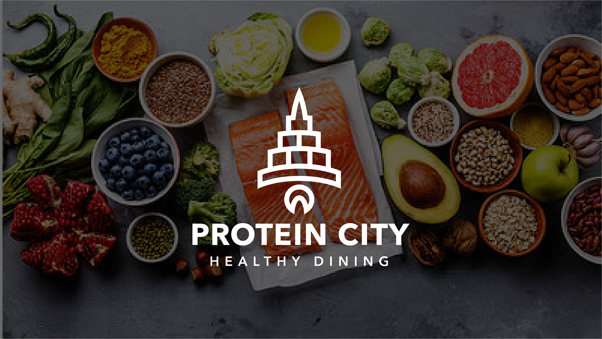
PROTEIN CITY
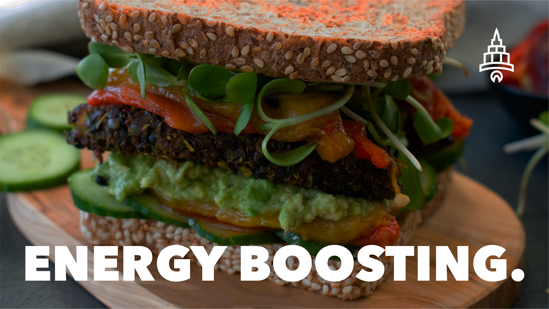
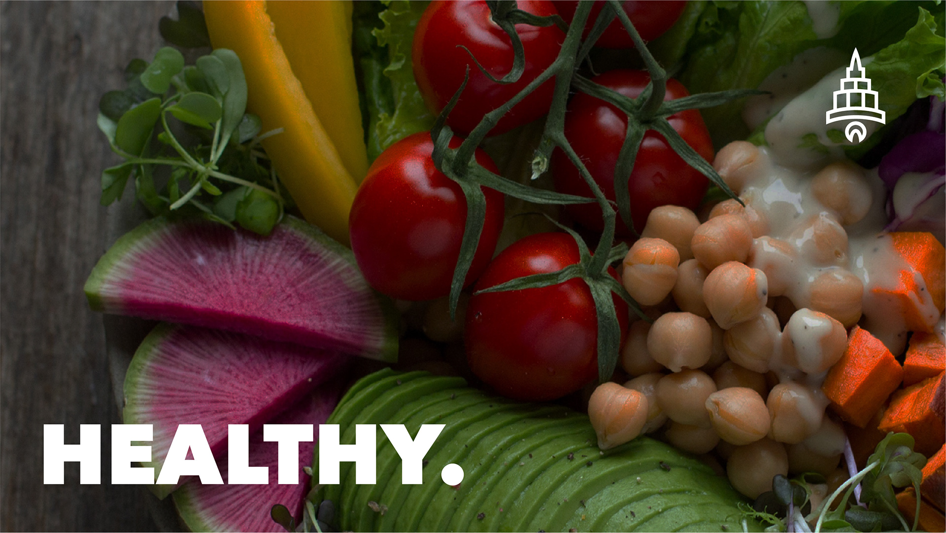
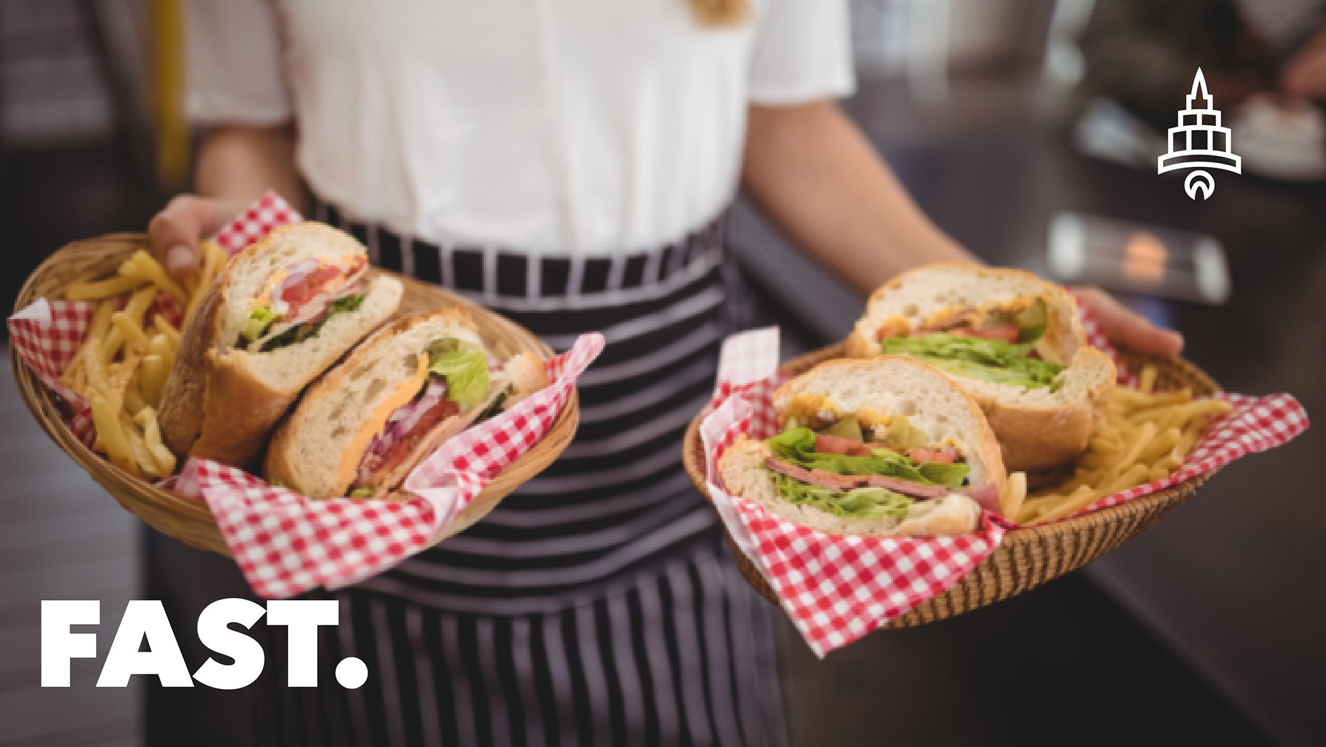
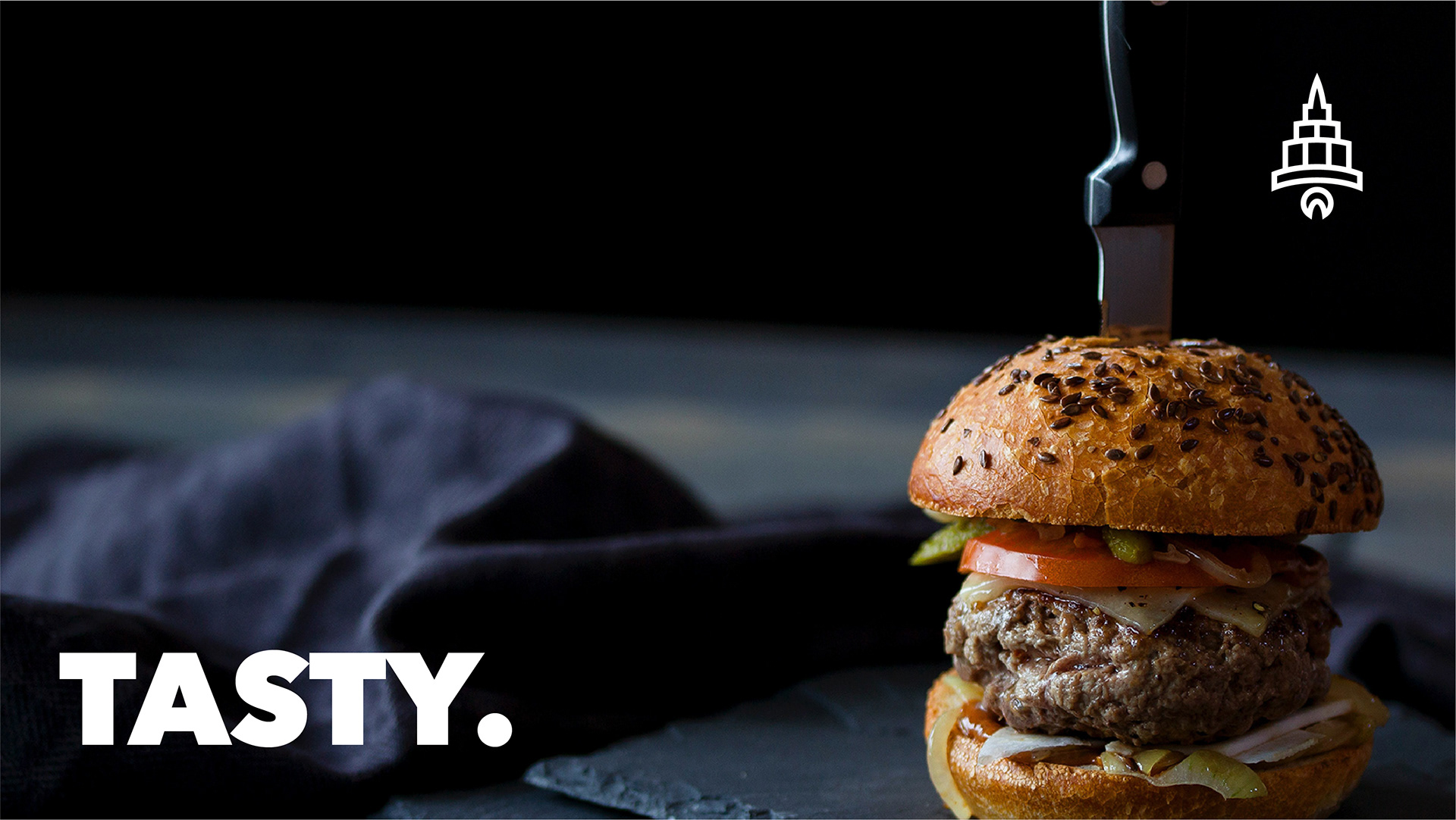
Protein City was founded on the core belief of making healthy, affordable food accessible to everyone—offering nutritious meals made with fresh ingredients, free from chemicals and preservatives. While the brand successfully delivered on its mission of providing better-for-you fast food, its original visual identity reflected a more budget-oriented aesthetic that no longer aligned with evolving consumer expectations and market positioning.
This rebranding initiative aimed to elevate Protein City’s image by transitioning from its original, low-cost visual presentation to a more sophisticated, modern brand identity. The objective was to create a design system that more effectively communicated the brand’s values—freshness, quality, and affordability—while resonating with a broader health-conscious audience.
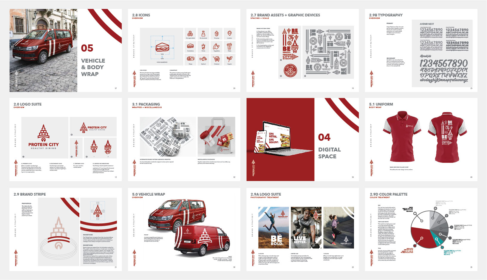
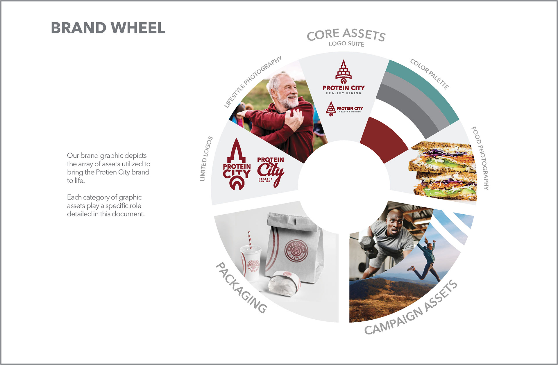
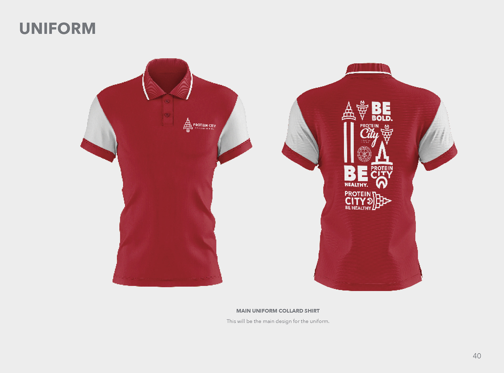
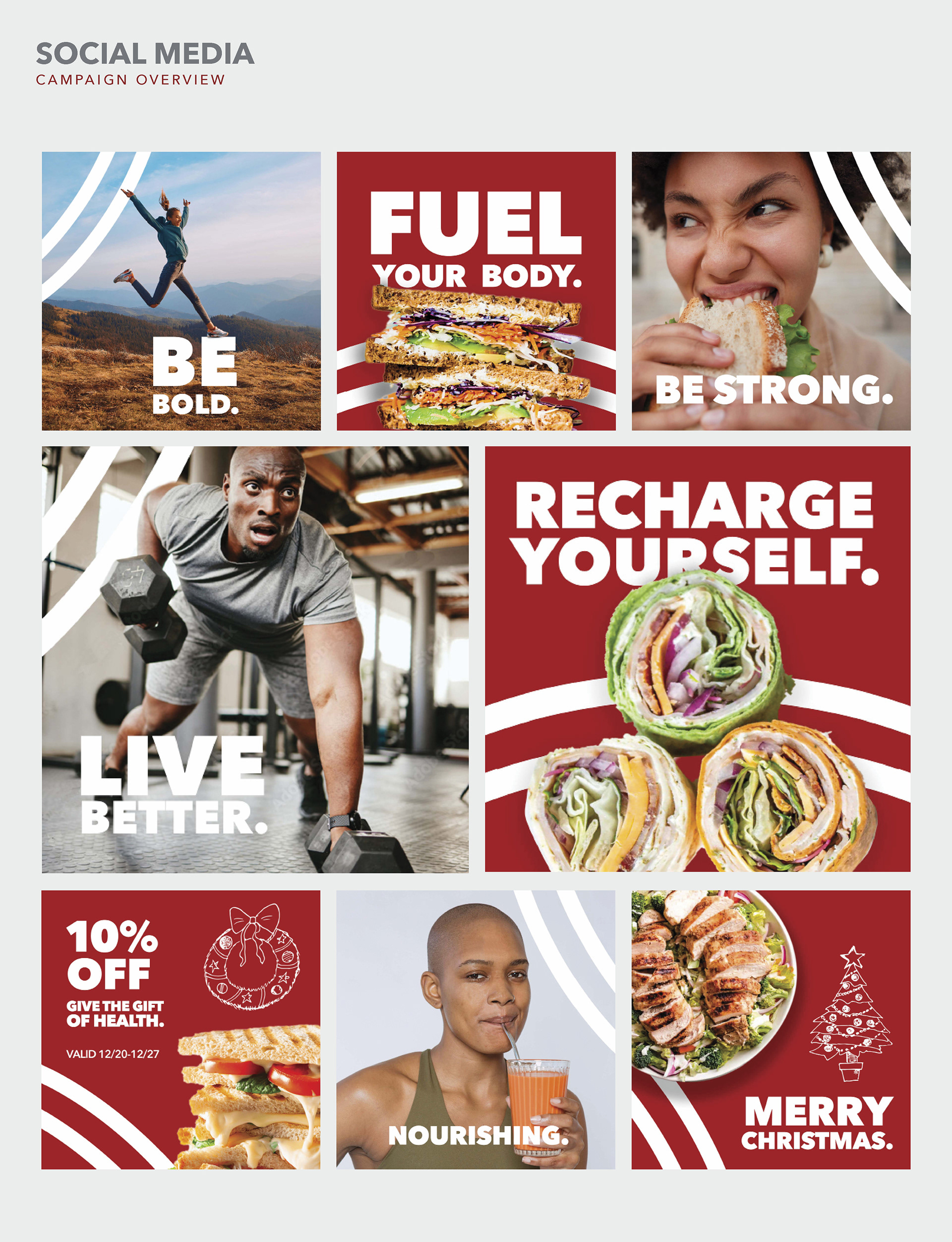
The project involved a comprehensive overhaul of the brand's visual language, including logo refinement, color palette development, typography, and packaging design. Each element was carefully designed to project a cleaner, more contemporary aesthetic while maintaining the approachability and inclusivity that define the brand. The result is a cohesive and elevated identity that enhances customer perception and strengthens emotional and visual connections with the target market.
CASE STUDY
PROBLEM: Upon Protein City's inception, a "playful" visual brand identity was incorporated from the start. The issue with this approach was the wrong impression it conveyed. As with most fast food places, a "playful" "vibrant" "fun" branding is also used to attract a certain market. A market that usually tends to fast food places for its fast but not particularly healthy foods. Protein City realized if they wanted to stand out from the "fast food" bug, they needed to pivot and rethink the brand.
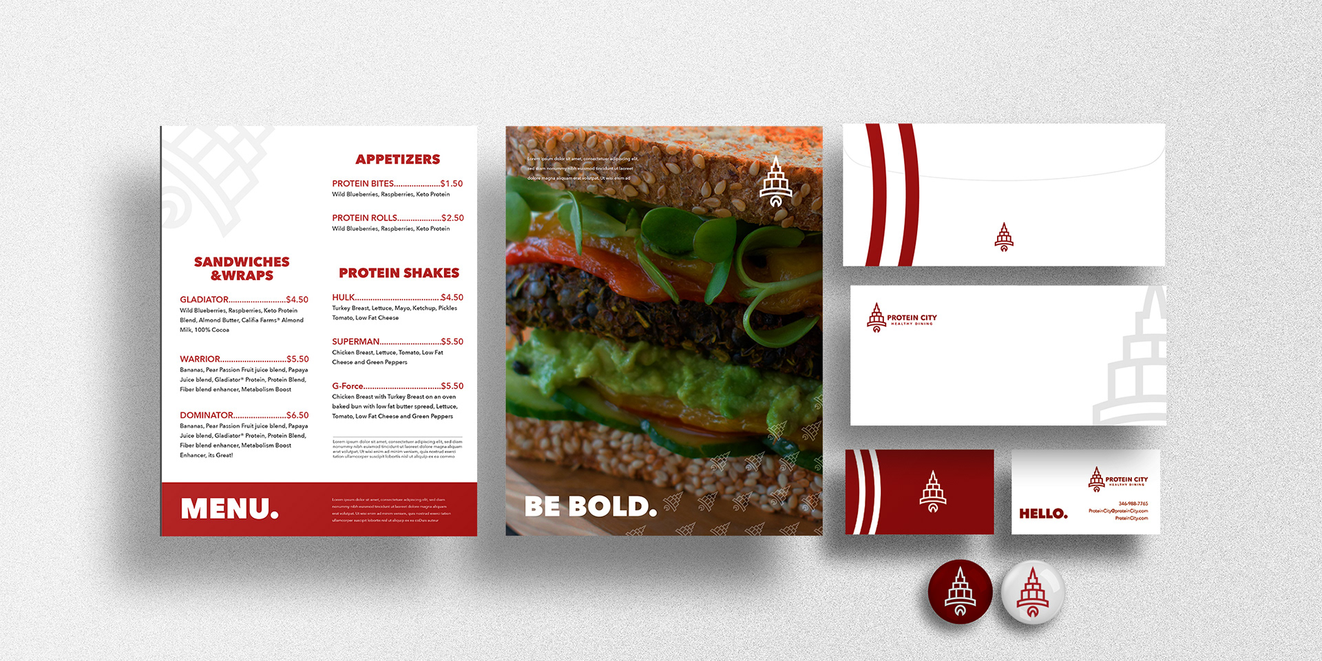
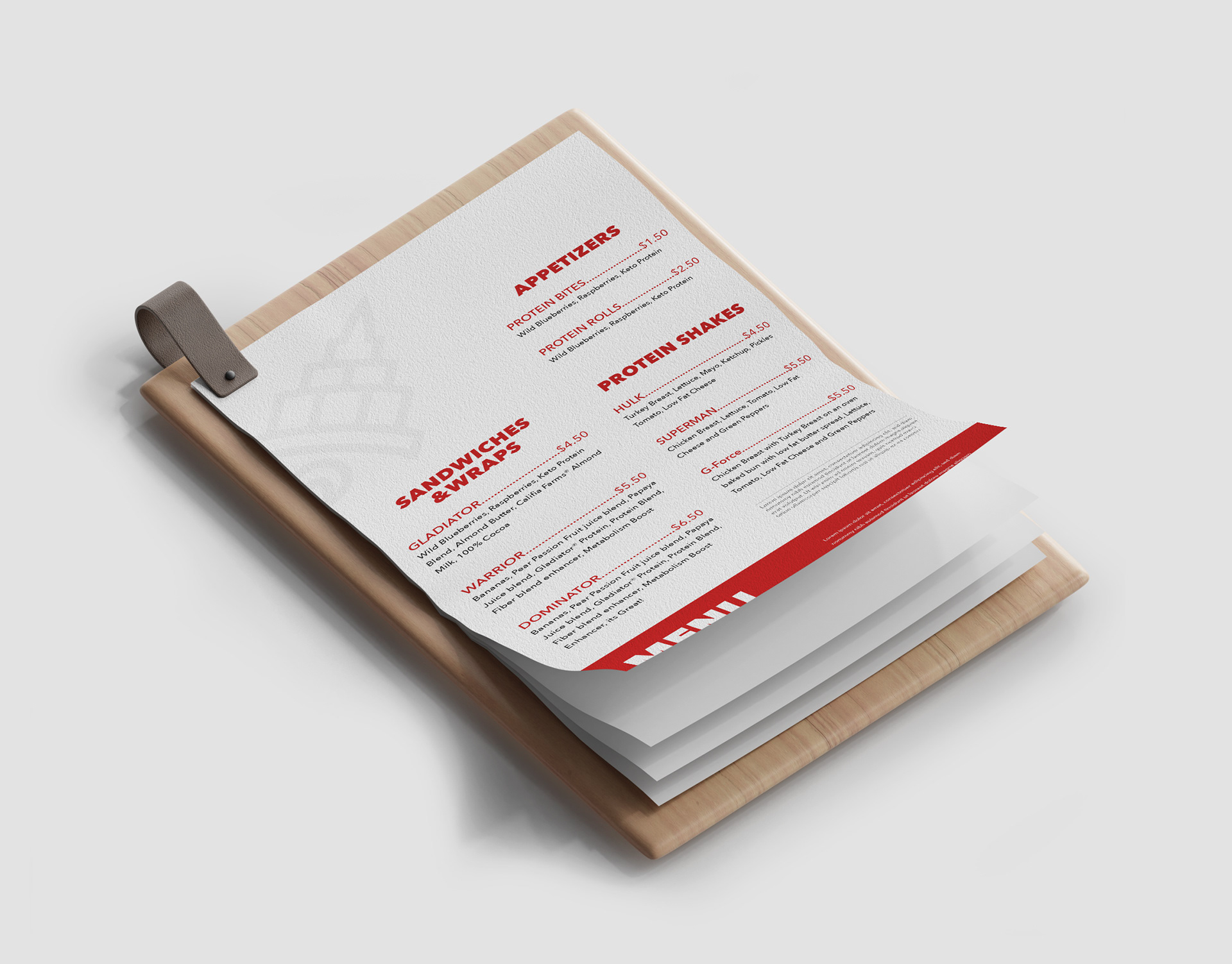
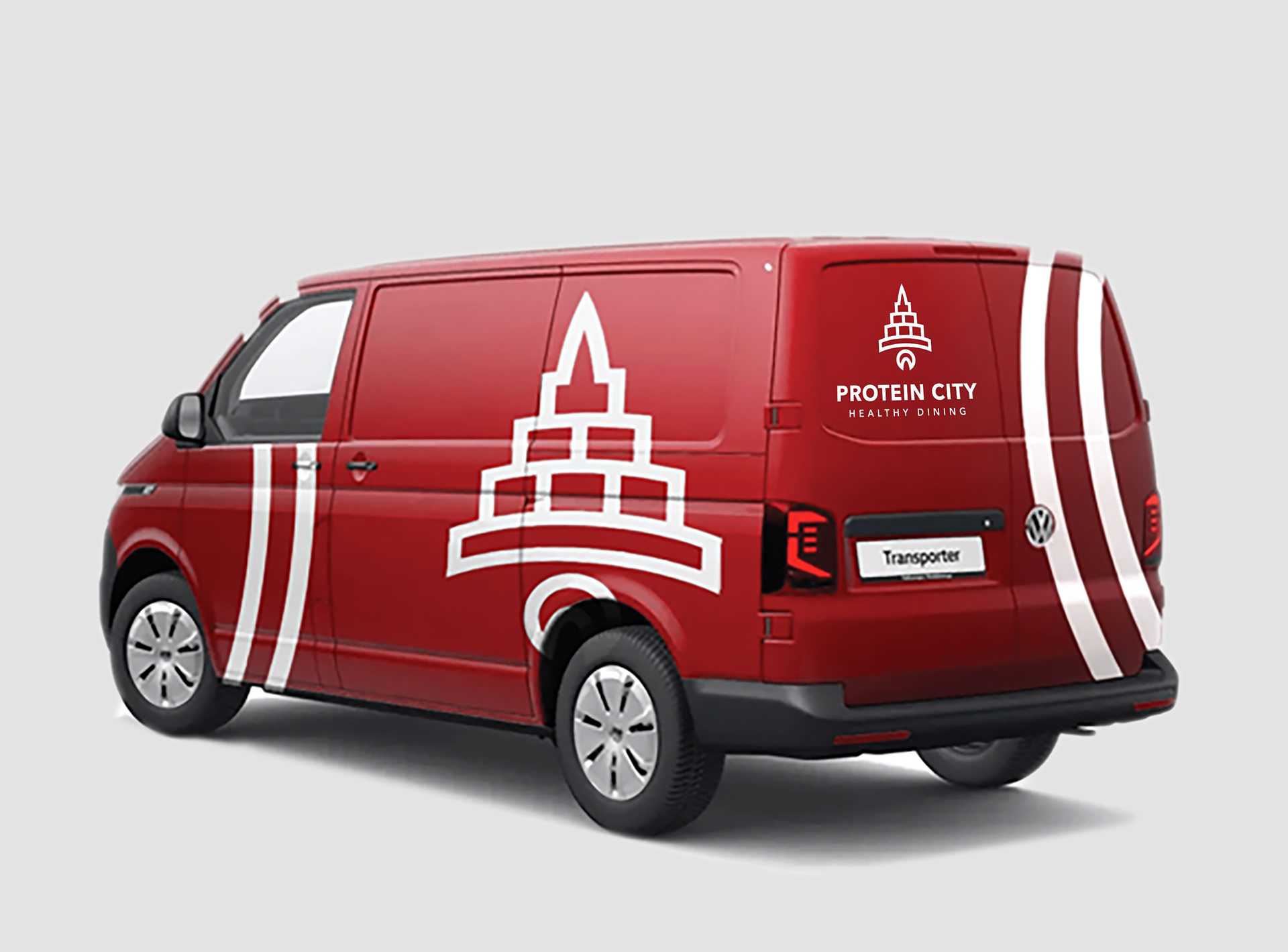
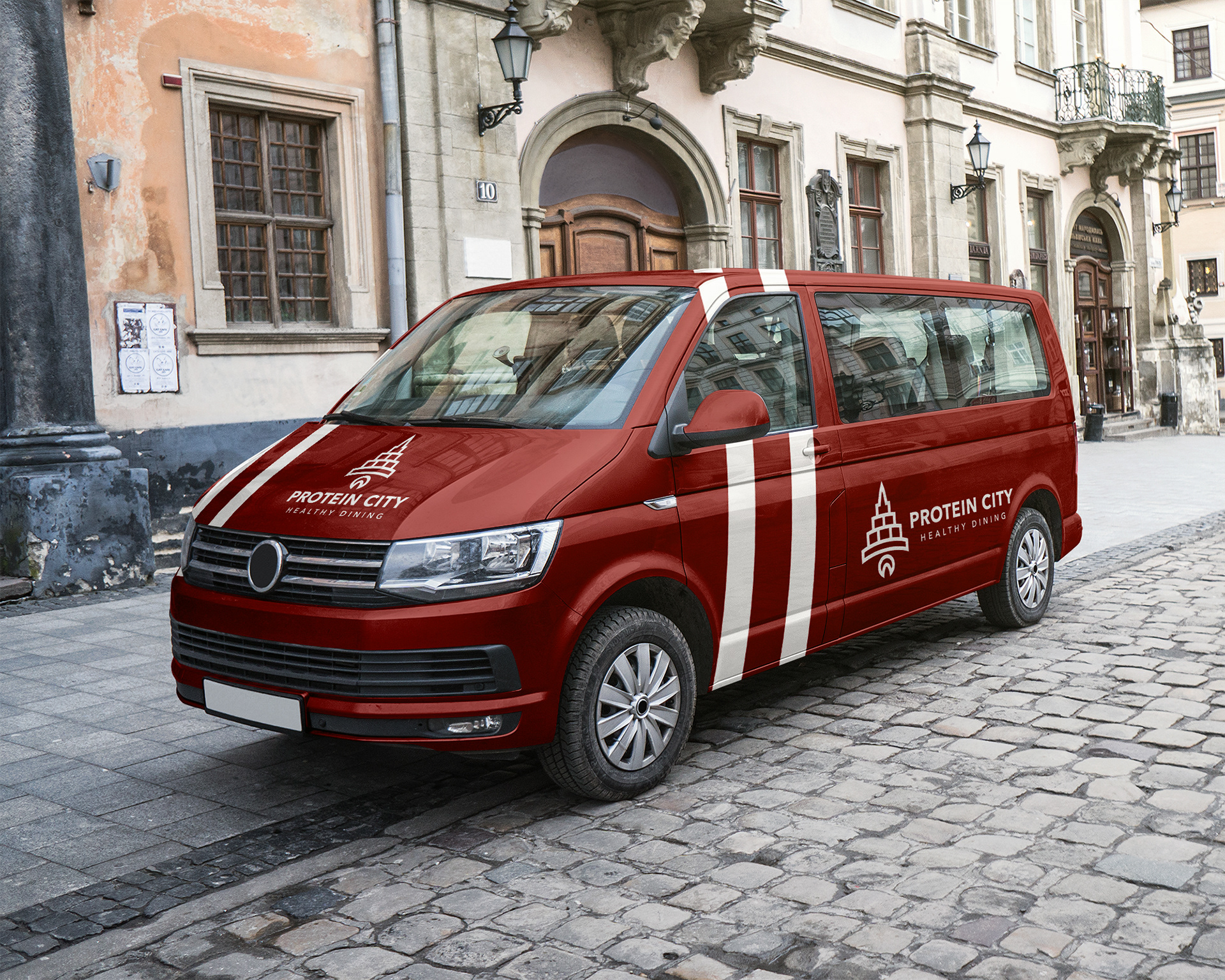
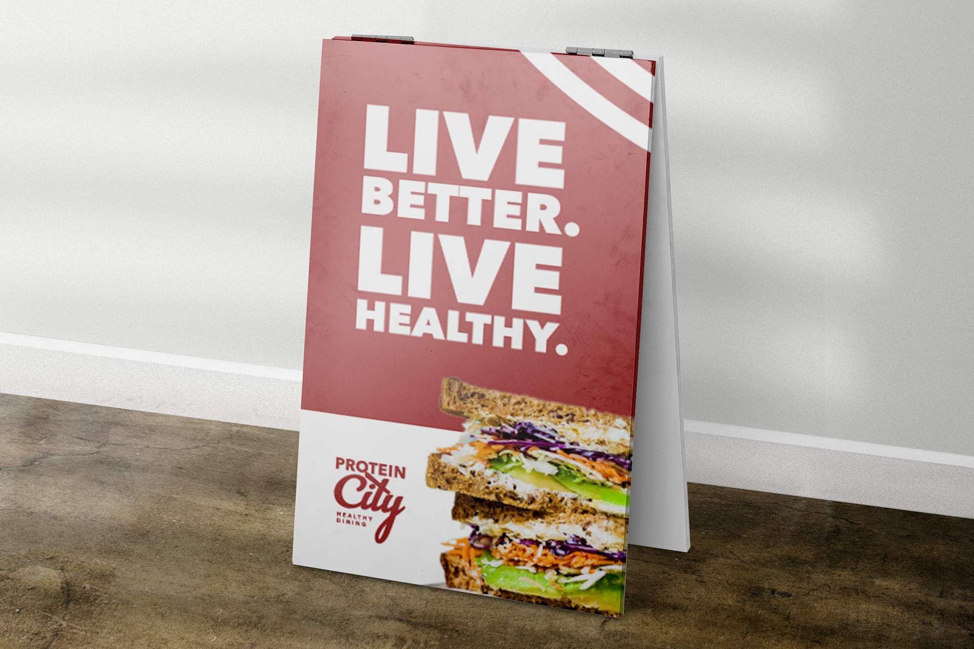
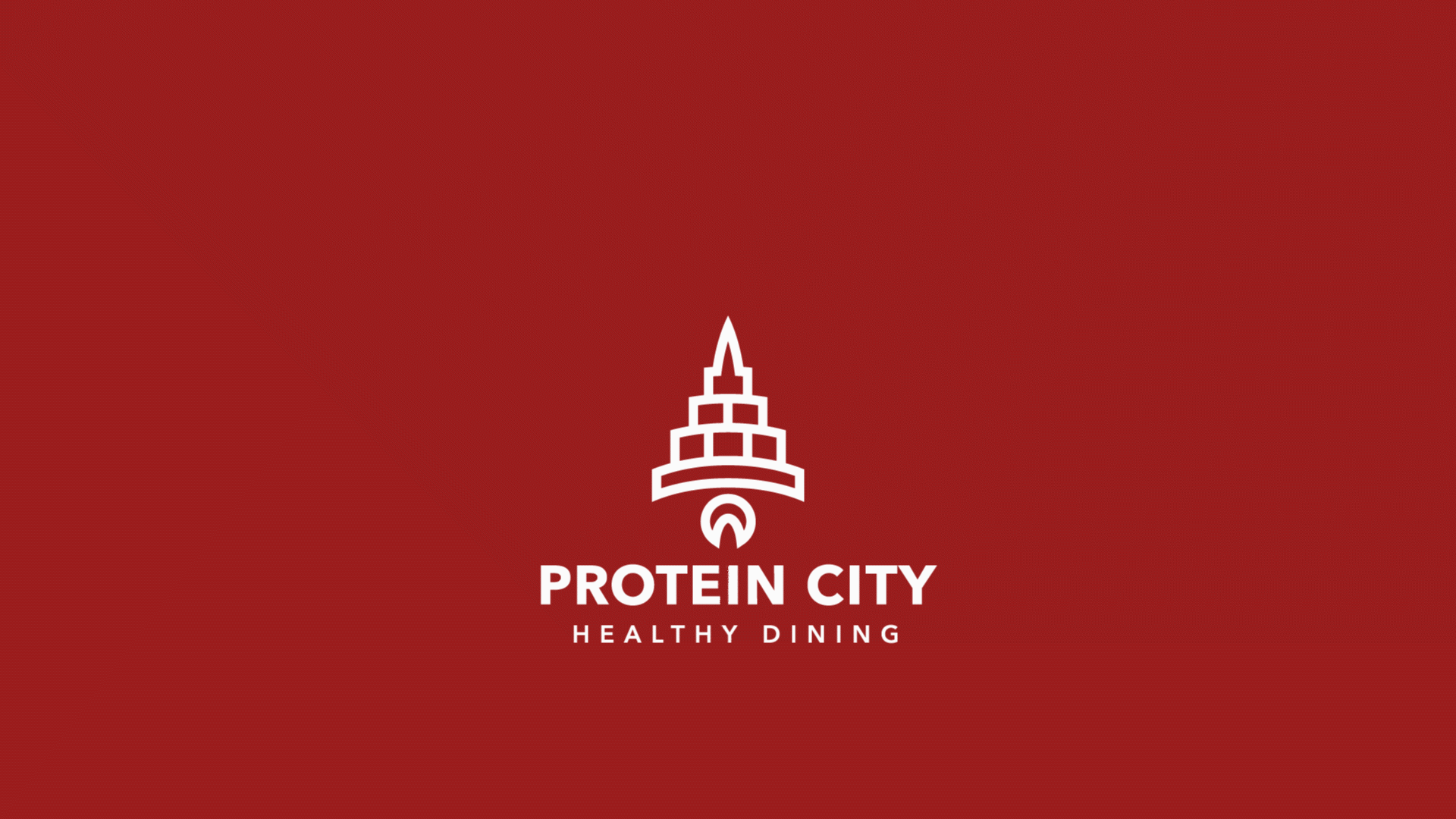
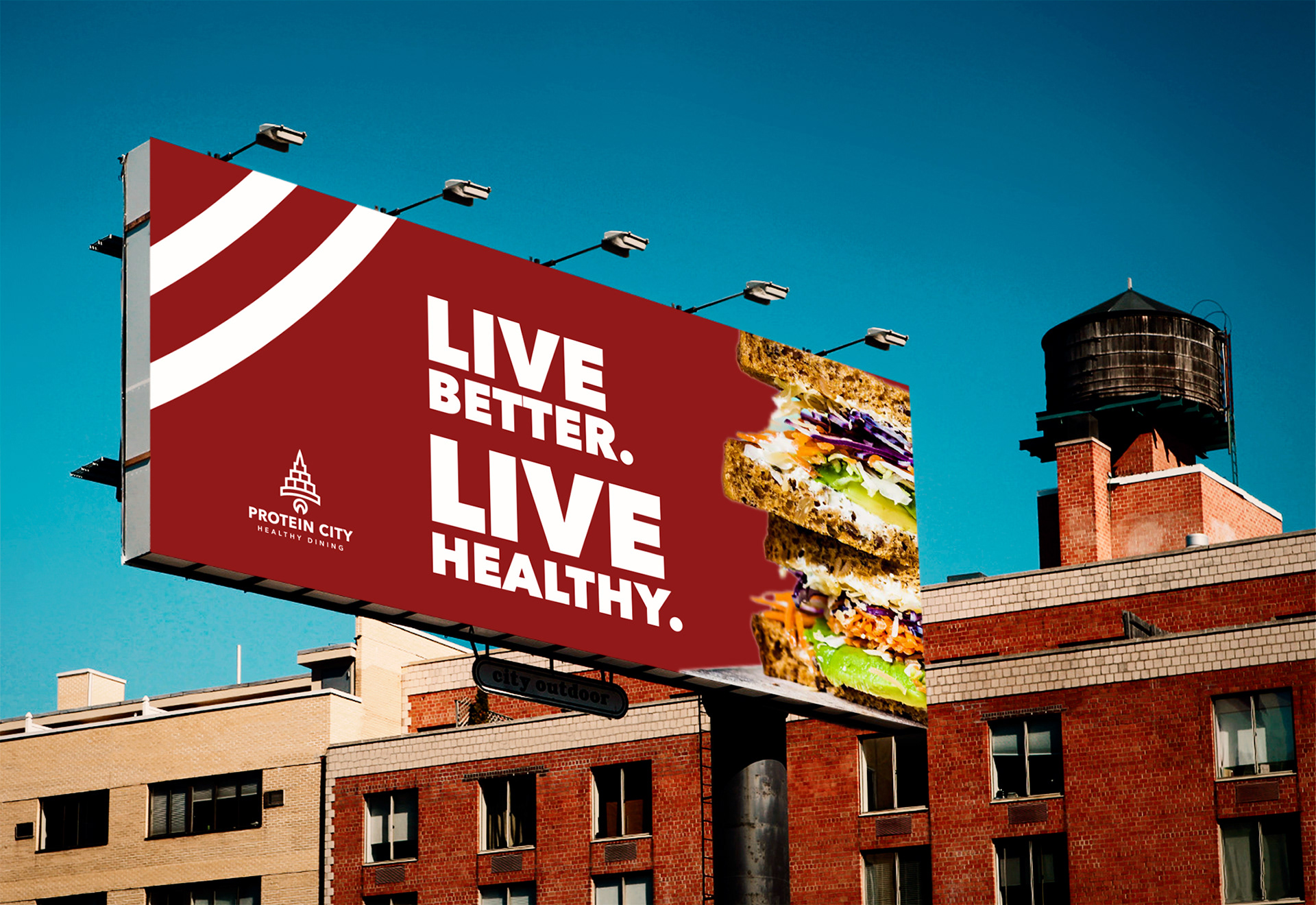
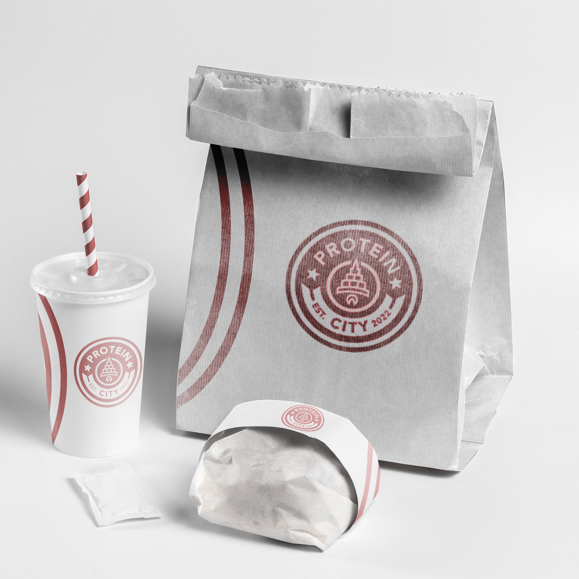
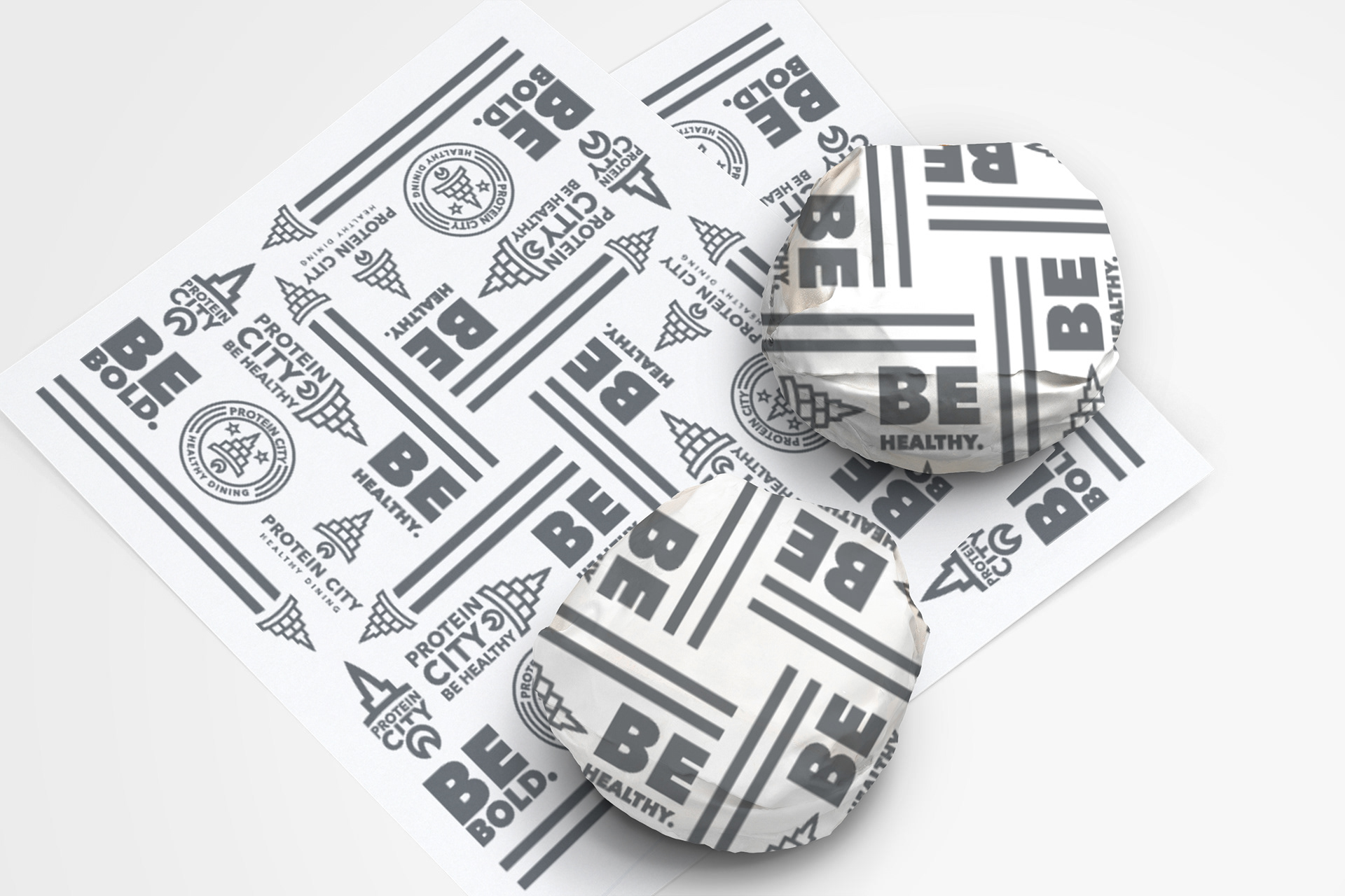
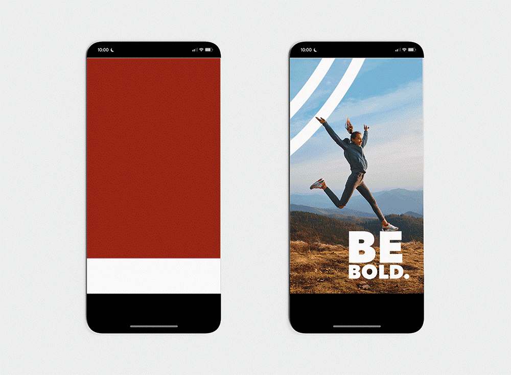
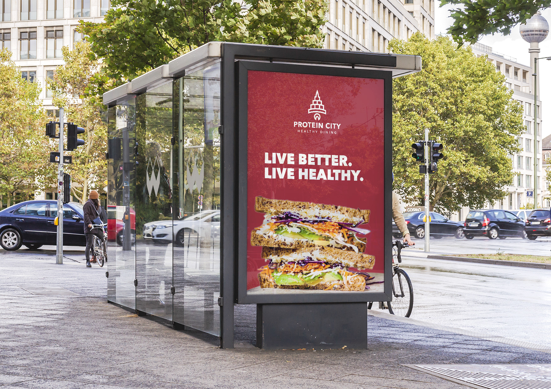
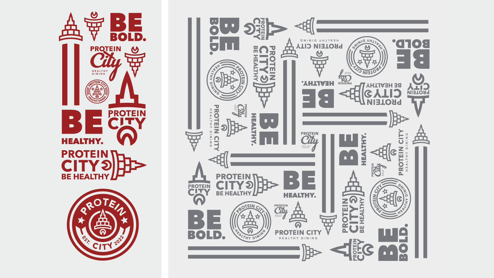
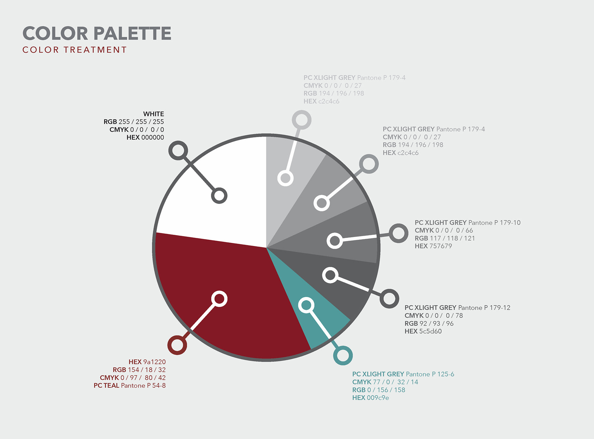
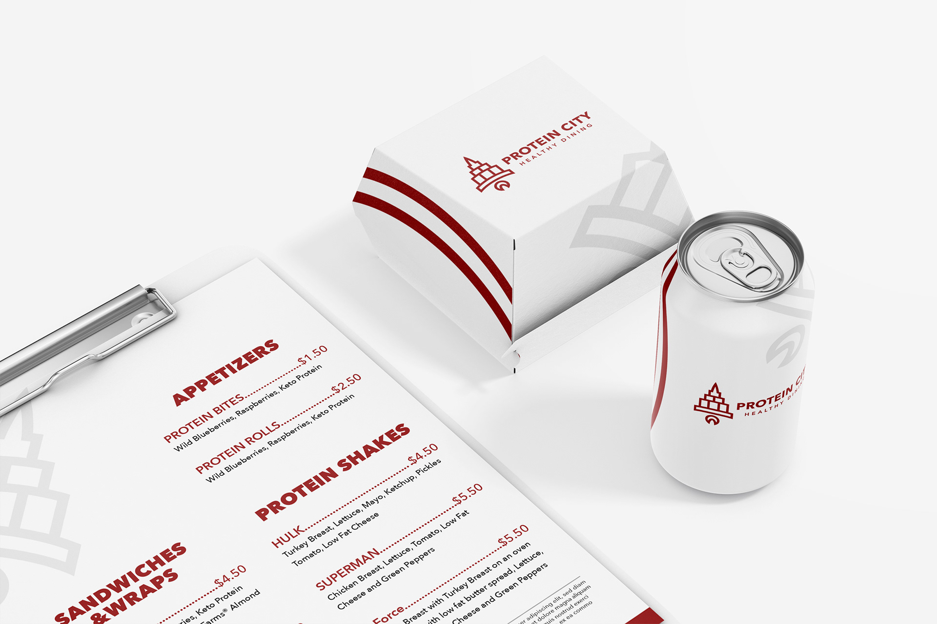
SOLUTION: Protein City changed their former "fast food" visual vibe to a more sophisticated but not so serious design by using a more monochromatic neutral darkened red tone and white as their primary colors. The original "rocket" logo was "cleaned up" with a more geometric structured and symmetrical feel. The "cleaner" and simpler look hints towards the company's healthy food offerings without breaking the bank. The rocket "swoosh" has also been used throughout packaging and displays and has evolved to a more "even" or geometric feel over the former organic "cartoony" feel of previous branding.
PROBLEM: Upon Protein City's inception, a "playful" visual brand identity was incorporated from the start. The issue with this approach was the wrong impression it conveyed. As with most fast food places, a "playful" "vibrant" "fun" branding is also used to attract a certain market. A market that usually tends to fast food places for its fast but not particularly healthy foods. Protein City realized if they wanted to stand out from the "fast food" bug, they needed to pivot and rethink the brand.
SOLUTION: Protein City changed their former "fast food" visual vibe to a more sophisticated but not so serious design by using a more monochromatic neutral darkened red tone and white as their primary colors. The original "rocket" logo was "cleaned up" with a more geometric structured and symmetrical feel. The "cleaner" and simpler look hints towards the company's healthy food offerings without breaking the bank. The rocket "swoosh" has also been used throughout packaging and displays and has evolved to a more "even" or geometric feel over the former organic "cartoony" feel of previous branding.
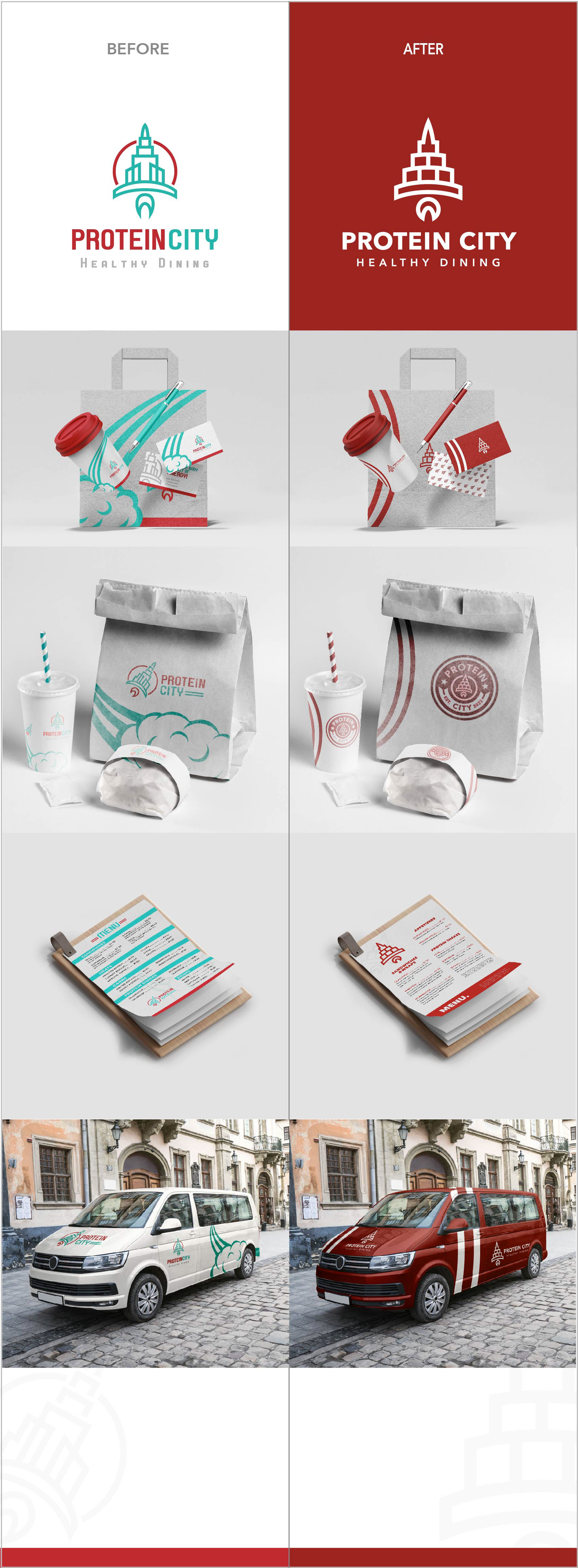
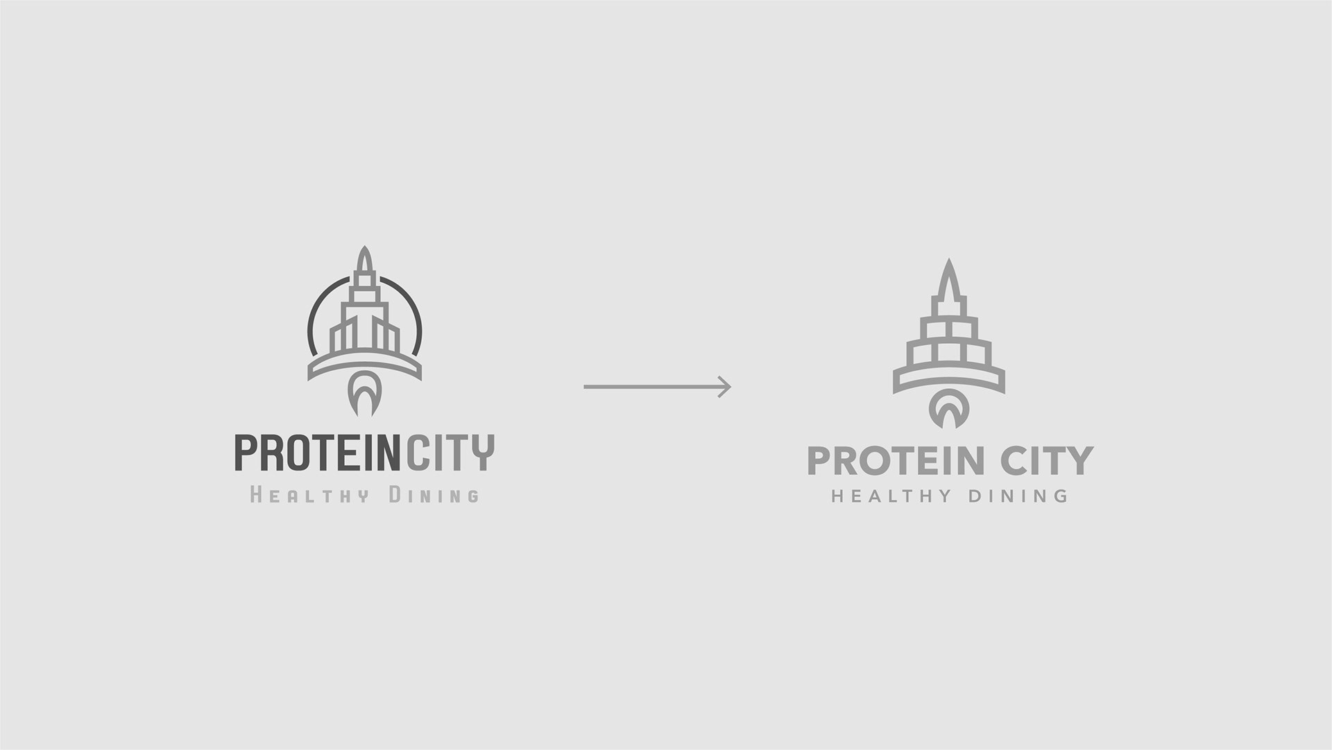
The logo redesign more accurately reflects the brand values through a more balanced appearance, bolder line weight and greater legibility at small scales.
The new adjustments exudes a more corporate touch adding a sense of trust and confidence for the target audience.
The new adjustments exudes a more corporate touch adding a sense of trust and confidence for the target audience.

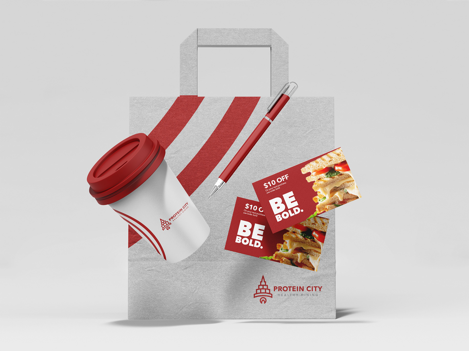

Alternate packaging design