LOGO
Curiosity Lab at Peachtree Corners is a cutting-edge technology company that specializes in developing autonomous vehicle solutions. They were looking to establish a strong brand presence through a unique and memorable logo that reflects their commitment to technological advancement and creativity.
COMPANY NAME
Curiosity Lab at Peachtree Corners
TARGET AUDIENCE
Technology companies and start-up companies wanting to test emerging technology on a live environment.
COMPANY DESCRIPTION
Autonomous Vehicle and intelligent mobility test track and smart city laboratory. To create and facilitate an open innovation environment to test next generation smart city technology
GOAL
Offer test and demo sites for emerging technologie
Offer test and demo sites for emerging technologie
LOGO DEVELOPMENT
As I began brainstorming for ideas, some words that came to mind were: technology, city, startup, innovation, and mobility. With these in mind, I also began exploring other associated words to further expand my palette of ideas, much like mind mapping process. I began jotting these ideas down on paper then translated these written ideas into visuals.
After a many rounds of brainstorming sessions, client discussions and iterations, I digitized the strongest visual concepts that most closely related to Curiosity Lab vision. The graphic below depict the iterations leading up to the final and current logo design. The top eight designs were the final 8 strongest concepts prior to final design.
Collage of previous logo designs drafts that eventually led to the final rendering
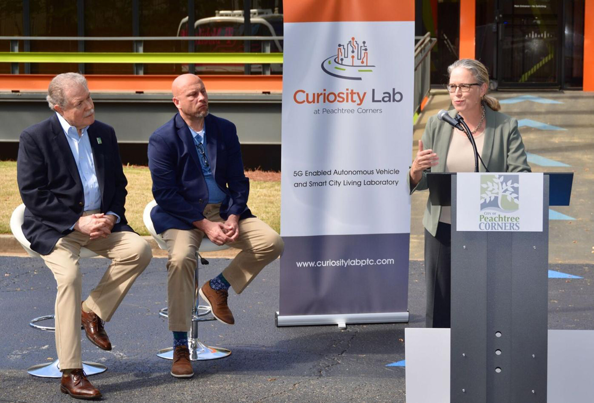
Logo featured on autonomous vehicle and city meeting banner
CURIOSITY LAB GATEFOLD BROCHURE
Designed informational brochure for the laboratory highlighting the laboratories special features and attractions. After several discussions and revisions over content, layout and overall design, the final version came to fruition.
The cover of the brochure features a unique die cut of a "circuit board building spire" at the top pushing the "urban" and "technological" feel of the brand. As the user opens the brochure, the curiosity lab logo is immediately depicted in the middle on either side of the "gates" with a brief introductory paragraph of the laboratory.
Continuing throughout the brochure is the visual theme of "circuit board lines" going up, down, and diagonally helping separate sections and information from each other. Color, type and imagery work together to bring the brand together in this brochure.
PEACHTREE CORNERS
DECATHLON EVENT LOGO
DECATHLON EVENT LOGO
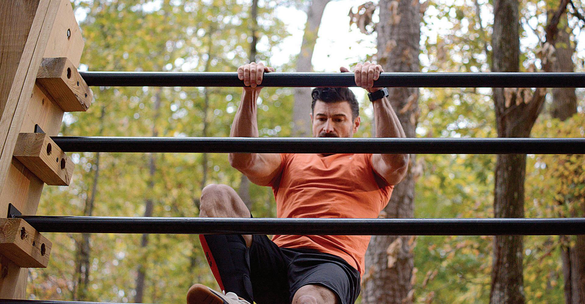
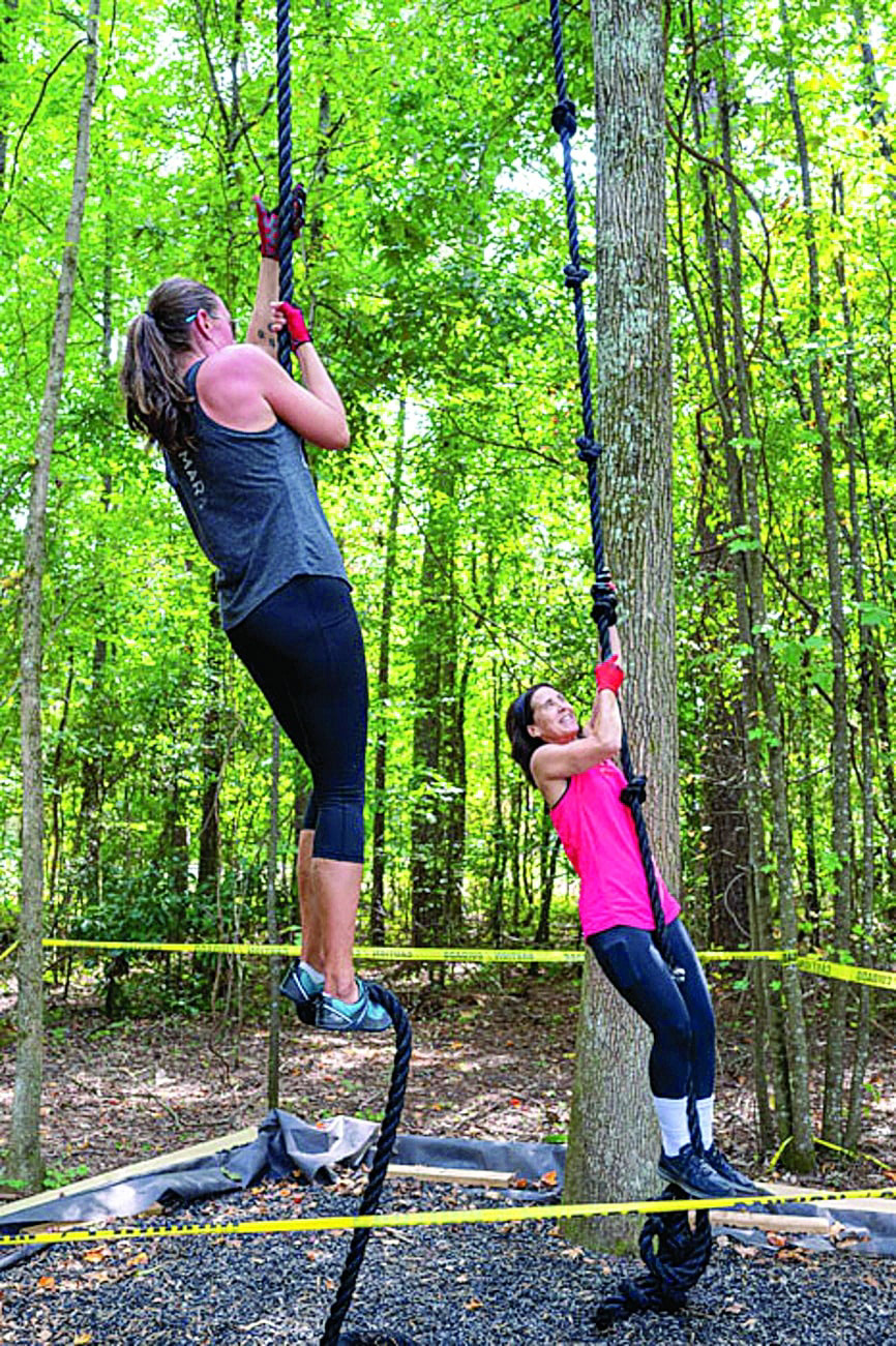
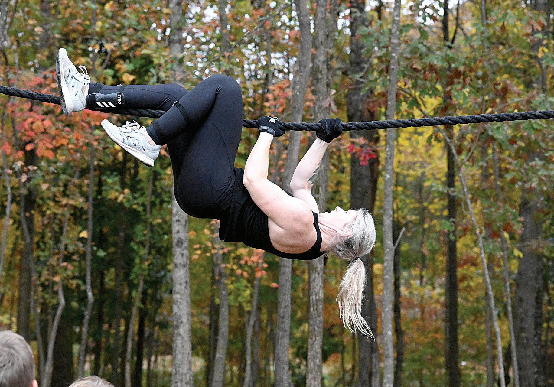
PTC also reached out to me in 2021 to design their first annual city decathlon event logo featuring challenging physical events held on the Town Green Path to Fitness. To begin the logo design process, I had to first think of how to represent each event using icons.
After researching and a few brainstorming sessions I was able to illustrate each event using a simple illustration for each event. Sixty participants compete in 10 events and awards are presented in several categories. Events featured are: bender, multi rig, rope climb, olympus wall, rope traverse, sand bag carry, row, run, box jump and wall climb.
Logo featured on event award plaque
Event roll-up banner design
AUTONOMOUS VEHICLE WRAPS
I was also given opportunity to brand each autonomous vehicle shuttle for T-mobile, BOSCH, GA Tech, RaceTrac, OVHcloud, LG, Siemens and Humanetics. With each shuttle design I played around with the corresponding companies design elements such as color, pattern, layout, and logo that were most iconic, unique and/or distinguishable to "decorate" or "fill" out the shuttle "canvas".
BOSCH
For this shuttle I used the gray tone from logo on the bottom trim/wheel well area of the shuttle and incorporated their complementary branded red, purple, and blue color scheme as bold stripes toward the back section of vehicle and as an accent at the top.
T-Mobile
T-Mobile, uses a bright monochromatic pink color scheme which I knew had to be part of their theme in this shuttle. Since I did feel somewhat limited as to what visual cue to use in this design, I thought about putting visual emphasis on the iconic, ubiquitous capital serif "T" in the logotype. I used this "T" to bring the design together utilizing complementary geometric pattern/design throughout the vehicle.
SIEMENS
Siemens is known for their automation, digitalization and technology, which inspired the use of circuit board pattern. Siemens "teal" hue was used on the bottom trim / wheel well section as an accent and body of vehicle was kept mostly clean. The circuit board pattern initiates at the front of vehicle with the "via's" or "dots" at end of each line facing towards the back of vehicle appearing as if "circuit" pattern was traveling in reverse and vehicle traveling forward similar to how a U.S. flag would appear inverted on an army vehicle placed on passenger side.
RACETRAC
I used Racetrac's blue / red color scheme in this layout adding a bold diagonal or slanted color bars in front and back portion of vehicle to add visual "movement" and a subtle visual brand connection with the slanted bold "Racetrac" logotype.
OVHcloud
OVHcloud is a cloud computing company and uses triangle and circles as visual elements of the brand which I incorporated into the shuttle by overlapping these shapes in order to create a rhythmic visual pattern adding a subtle dynamic feel to overall layout.
LG
Similar to T-Mobile, LG uses similar color scheme, (although a darker red hue) and I wanted to play off the circle logo and use the overall circle reddish in color shape as a platform to use in setting a visual tone on the shuttle utilizing more negative space hinting towards a cleaner modern design.
HUMANETICS
Humanetics is a Digital Industrial Technology company which uses an overall circular logo with a blue monochromatic color scheme. The logo is divided into several pieces in different shades of blue which I used as inspiration to create the design of this shuttle.
GEORGIA TECH
Well known technical institute, the Georgia Tech shuttle features its golden Kessler Campanile icon oversized and bleeding off the format as a visual brand identity cue. I continued with the "golden diagonal" lines as a brand pattern towards rear of vehicle, further pushing brand recognition on the vehicle.
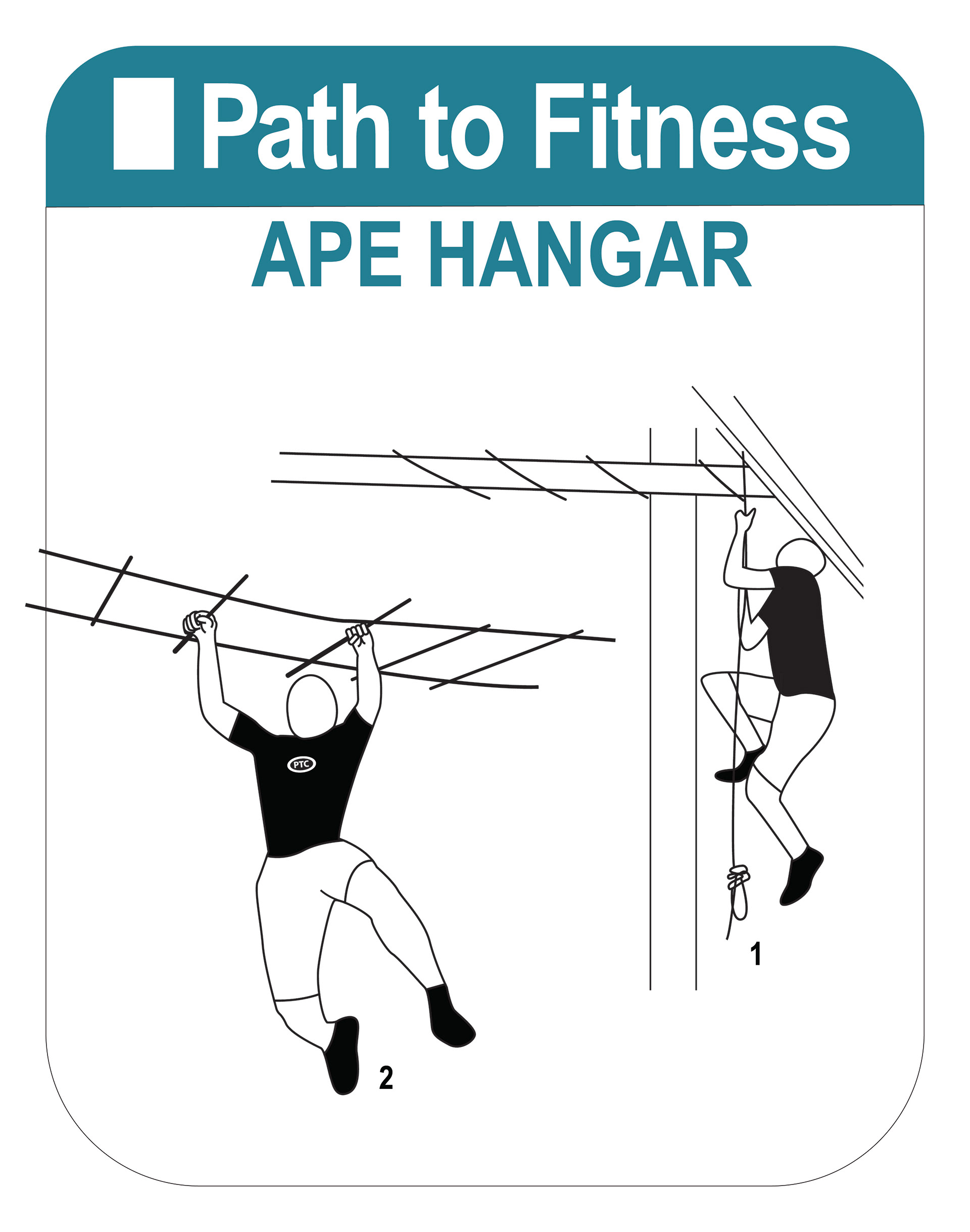
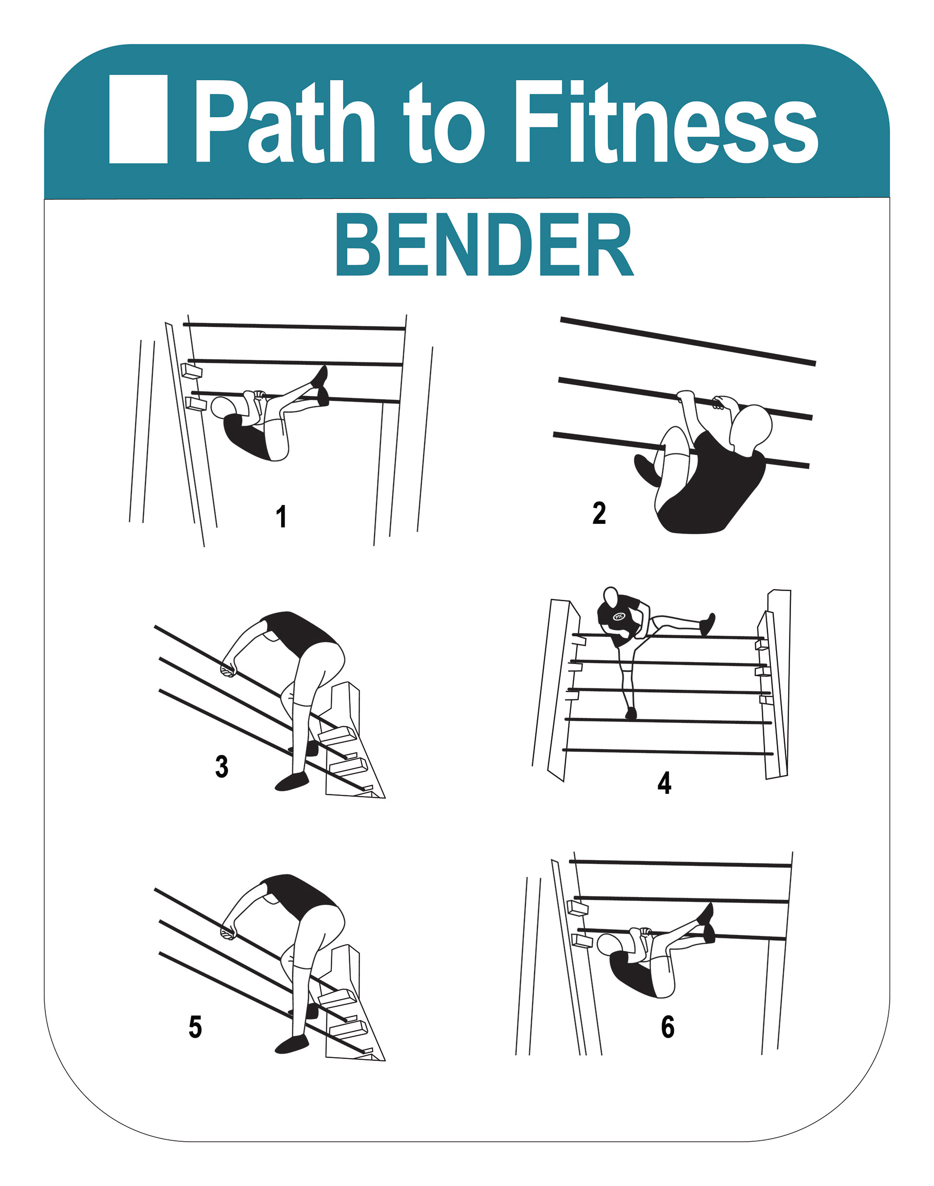
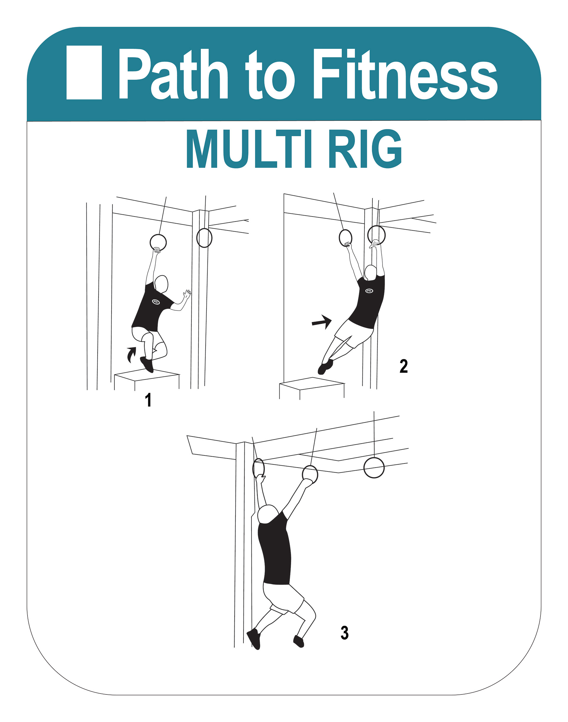
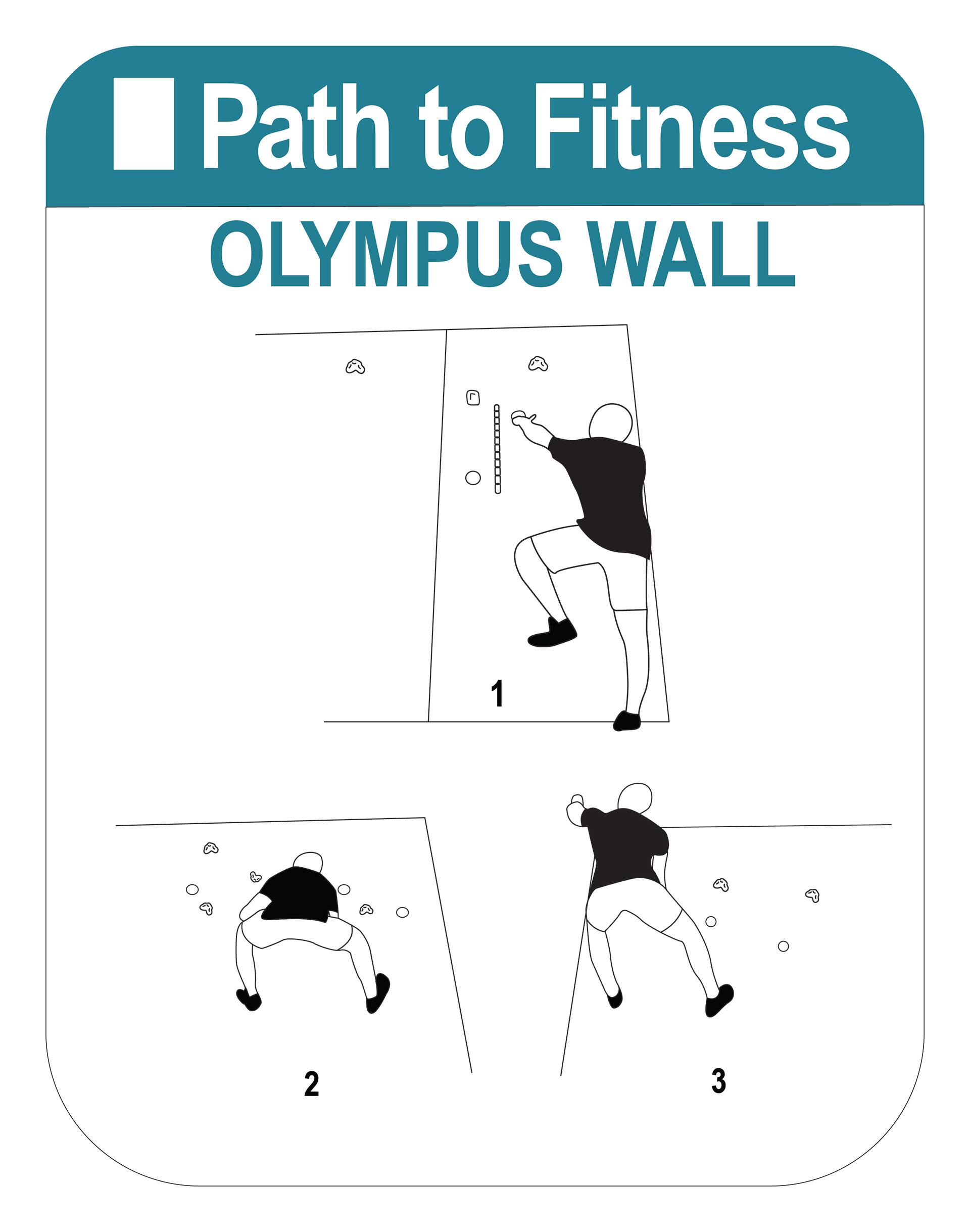
SIGNS FOR PATH TO FITNESS
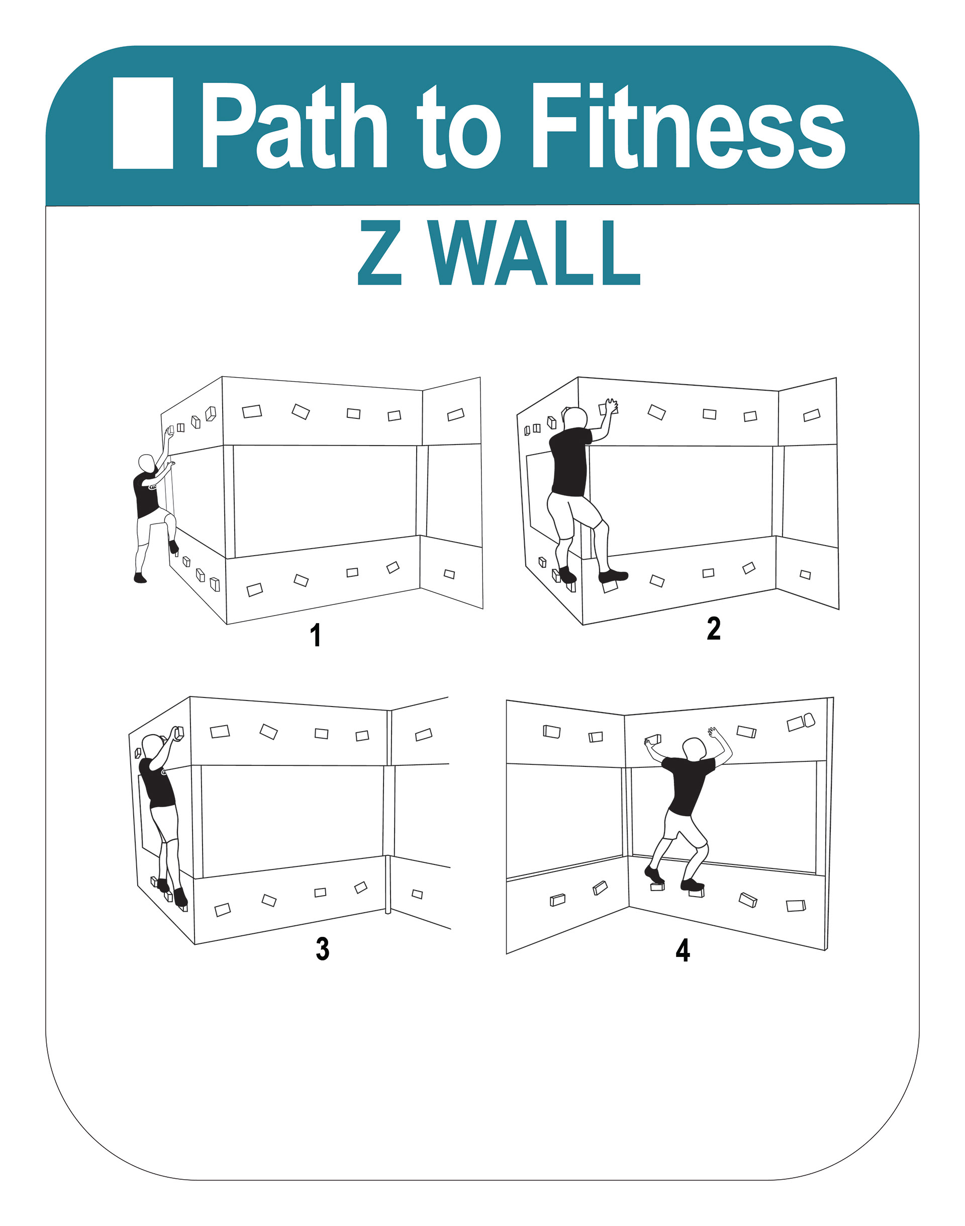
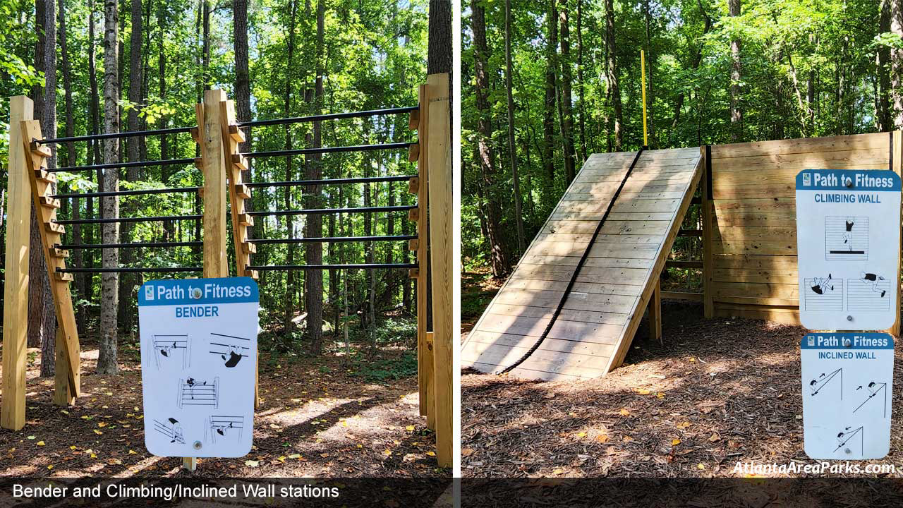
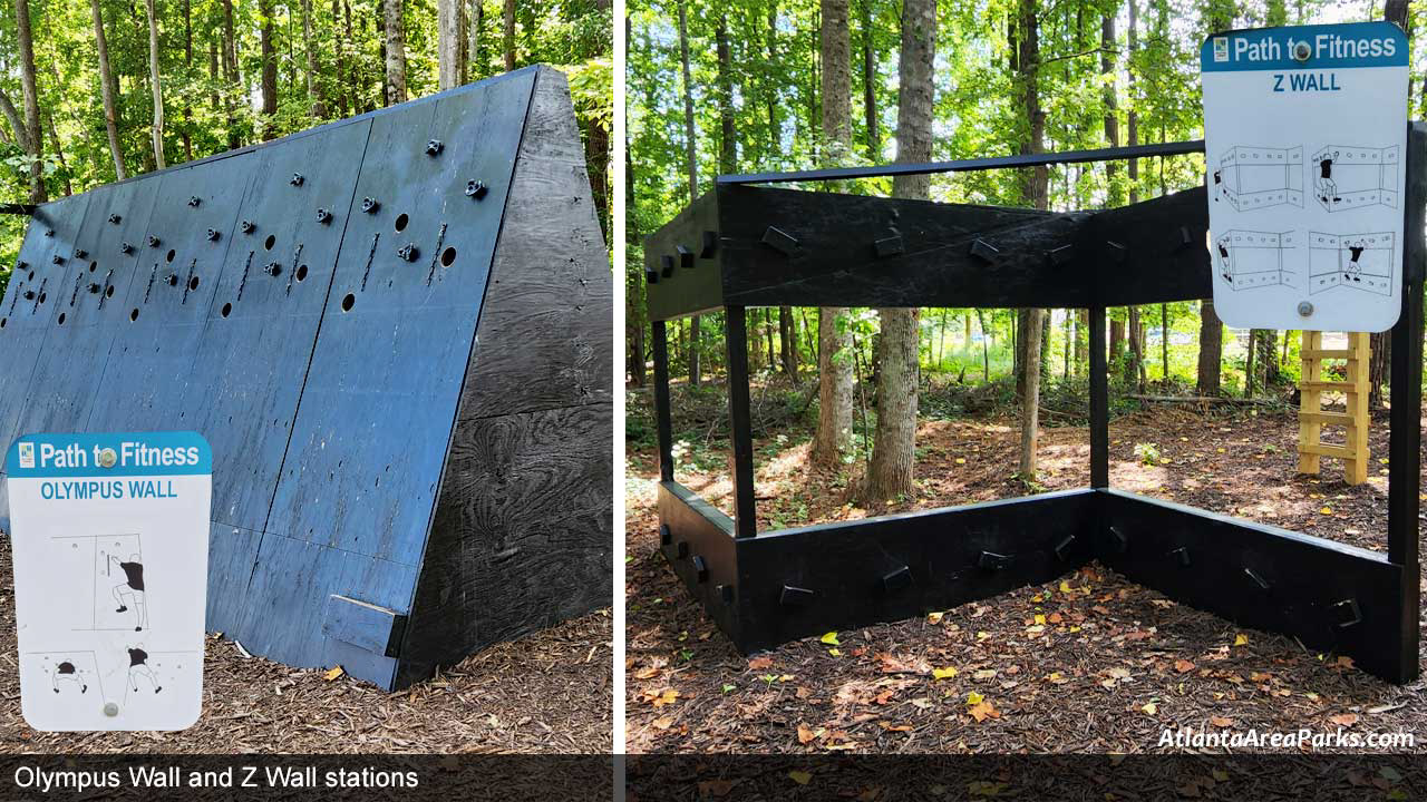
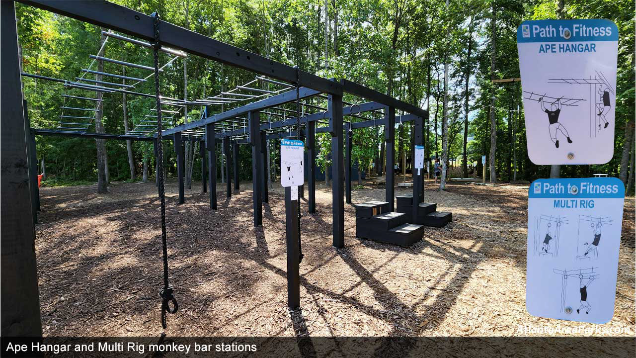
I was honored to design several of the fitness signs for the Path to Fitness at Peachtree Corners Town Green. I was tasked to design and complete a series of instructional signs for the city's fitness obstacle course. I was to show how each exercise was to be performed by an illustration of a person performing each movement.
I was able to draw these figures in illustrator after researching the image that offered the best angle/position for each exercise that would most clearly convey to the user how to use each equipment. Path to Fitness is an obstacle course in a unique green space that combines the fresh air of the outdoors with high-quality fitness equipment similar to that you might use in a gym.
I was able to draw these figures in illustrator after researching the image that offered the best angle/position for each exercise that would most clearly convey to the user how to use each equipment. Path to Fitness is an obstacle course in a unique green space that combines the fresh air of the outdoors with high-quality fitness equipment similar to that you might use in a gym.
